We rebuilt our login page, and the stack underneath it
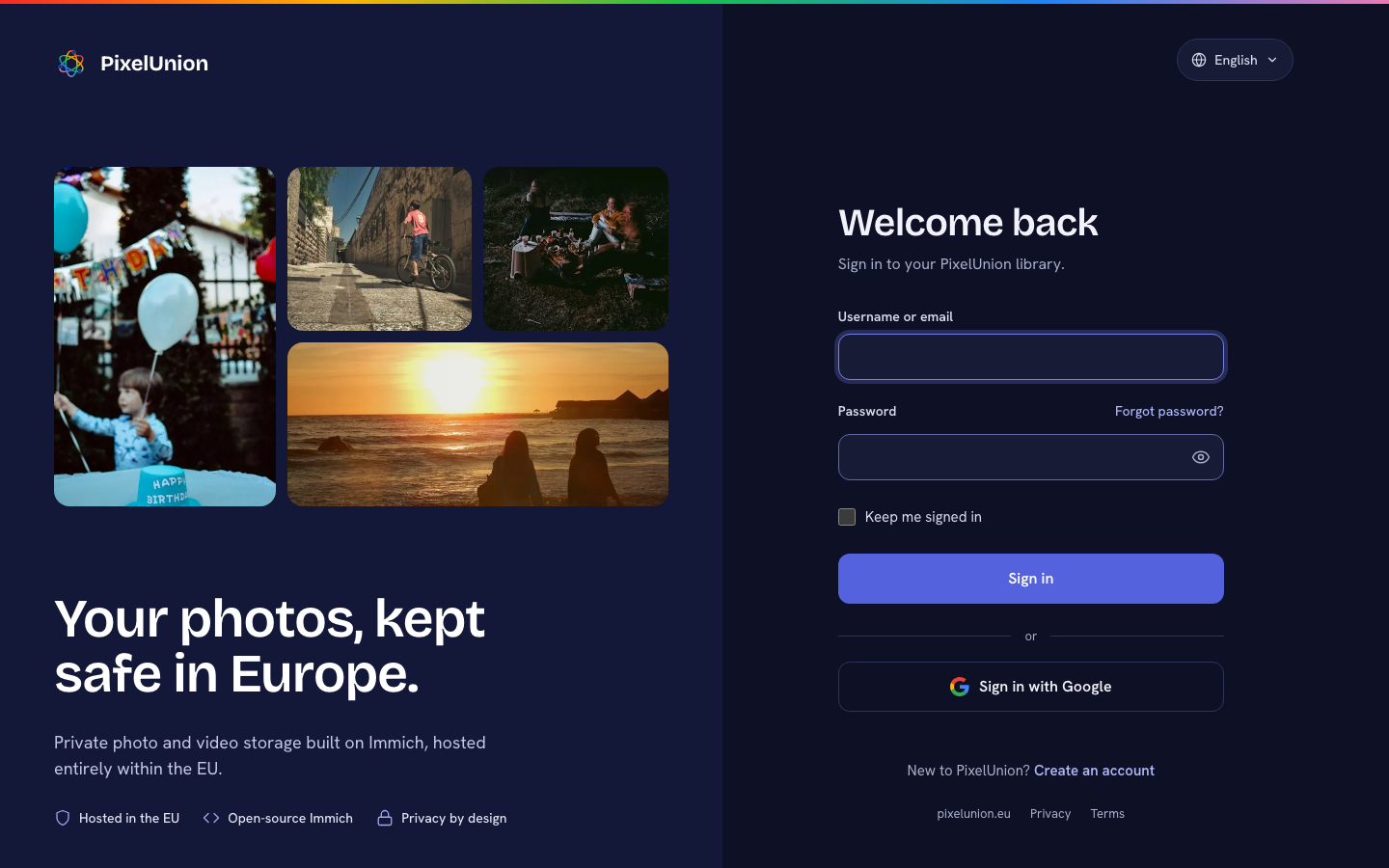
The login page is the one screen every PixelUnion user sees, usually several times a week. Until now it was the default Keycloak look with our logo on top. It worked. It also looked like enterprise software from 2014, and it did not tell you anything about where your photos actually live. So we rebuilt it, together with the account console behind it.
Quick recap for context: since our move to Keycloak, Keycloak is our identity provider (IdP). It handles your password, two-factor authentication, passkeys, and “Sign in with Google”, so Immich itself never has to. That part stays exactly the same. What changed is everything you see while it does that work.
Why we used Keycloakify
Keycloak themes are written in FreeMarker, a server-side templating language from the Java world. You copy Keycloak’s templates, edit them, restart the server, and check the result by clicking through the real login flow. That loop is fine for swapping a logo. It is painful for a redesign, because some pages only show up in rare situations: an expired page, a second authenticator, a Google account that matches an existing email.
Keycloakify solves that. It is an open-source project, started by Joseph Garrone, that lets you write Keycloak themes as React components and compiles them into a regular theme jar that Keycloak loads like any other plugin. Its starter template is published under codegouvfr, the open-source organization of the French government, which we think is a nice detail for a European project. The source is on GitHub.
The part that saved us the most time is Storybook. Keycloakify ships mock data for every Keycloak page, so we could render all of them, in every state, without a running Keycloak server. We ended up with 112 page states, which we checked at desktop and phone width, in light and dark mode.
One rule we kept strict: we only changed the markup and the styling. Every form field name, id, and hidden input is the same as in Keycloak’s own pages. Keycloak does not know anything changed, and its security logic runs exactly as before. The tradeoff is ours to carry. Every page we redesigned is now code we maintain, and we have to re-check it whenever Keycloak releases a new version. For the pages that matter most, we think that is worth it.
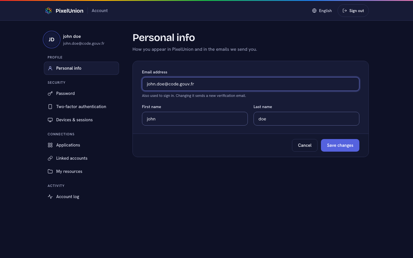
What changed for privacy and accessibility
A login page is a strange place to cut corners on privacy, so we tried not to.
- No third-party fonts. Both typefaces are bundled with the theme and served by us. Your browser does not contact Google Fonts or any other font CDN (content delivery network).
- Our own photo copies. The photos on the login page are stored and served by us, not hotlinked from the photo site. Each visit loads one set of four, about 60 to 120 KB. Phones do not load them at all, because the photo panel is not shown there.
On accessibility, every button and link is at least 44 pixels tall, so it is easy to hit with a thumb. Text fields use 16-pixel text, which stops iPhones from zooming in when you tap them. All text meets a 4.5:1 contrast ratio against its background, including in dark mode. The login page follows your system’s light or dark setting on a computer, and is always dark on a phone.
Is a login page the most important part of a photo service? No. Your photos are. But it is the front door, and it should look like someone cares about the house. We are going to keep improving both.
Photo credits
The photos on the login page come from Unsplash and are used under the Unsplash License. Attribution is not required, but these photographers made the page look the way it does, so here they are. Thank you.